AnimatedButton
An asset by G2P Studios
Install Asset
Install via Godot
To maintain one source of truth, Godot Asset Library is just a mirror of the old asset library so you can download directly on Godot via the integrated asset library browser
Quick Information


AnimatedButton
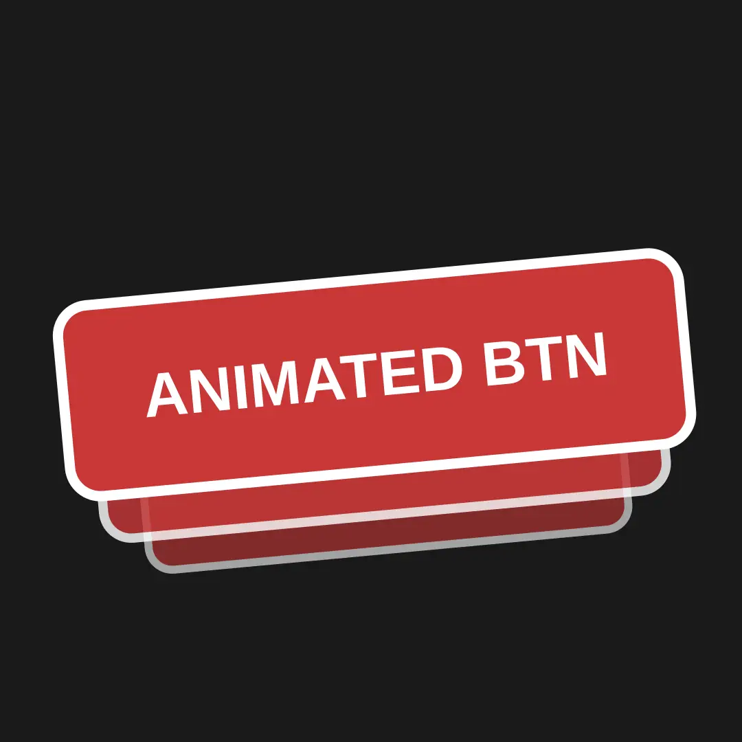
Custom button node that gives you some basic hover animations by default for scale and position.How to use:- Simply download the addon from release tab and copy it in your res://addons folder.- Then enable the plugin from the project settings.- Finally a new custom node called AnimatedButton will appear when creating a new node.
Supported Engine Version
4.3
Version String
v0.2alpha
License Version
MIT
Support Level
community
Modified Date
11 months ago
Git URL
Issue URL
Animated Button
Custom button node that gives you some basic hover animations by default for scale and position.
How to use
- Simply download the addon from release tab and copy it in your
res://addonsfolder. - Then enable the plugin from the project settings.
- And finally a new custom node called
AnimatedButtonwill appear when creating a new node.
Properties Overview:
Duration -> Its the duration for each animation
animate_scale -> Check if you wanna animate the scale property of button.
animate_position -> Check if you wanna animate the position property of button.
Scale Properties -> intensity -> It is the scale hover value, set this according to your desired scale value.
Position Properties -> position_value -> It is the position hover value, the button will animate to this position from its previous position.
This custom node is still being worked on and is very basic as of now. Im going to add more stuff into it while keeping it simple and easy to use.
Ideas for future:
- Add custom properties to animate.
- Enter and exit animations like fade, pop etc.
Custom button node that gives you some basic hover animations by default for scale and position.
How to use:
- Simply download the addon from release tab and copy it in your res://addons folder.
- Then enable the plugin from the project settings.
- Finally a new custom node called AnimatedButton will appear when creating a new node.
Reviews
Quick Information
AnimatedButton
Custom button node that gives you some basic hover animations by default for scale and position.How to use:- Simply download the addon from release tab and copy it in your res://addons folder.- Then enable the plugin from the project settings.- Finally a new custom node called AnimatedButton will appear when creating a new node.
Supported Engine Version
4.3
Version String
v0.2alpha
License Version
MIT
Support Level
community
Modified Date
11 months ago
Git URL
Issue URL