Universal Transition Shader
An asset by CashewOldDew
Install Asset
Install via Godot
To maintain one source of truth, Godot Asset Library is just a mirror of the old asset library so you can download directly on Godot via the integrated asset library browser
Quick Information

Universal Transition Shader
Check out the full documentation in the GitHub repository: https://github.com/cashew-olddew/Universal-Transition-ShaderThis shader provides a flexible and highly customizable system for creating animated transitions between visual elements in a Godot project. It supports a wide variety of transition styles, such as:- Directional Wipes: (left, right, top, bottom, diagonal)- Clock Wipes: (radial, with multi-sector support)- Iris/Shape Reveals: (polygon-based transitions with any number of sides)- Dissolves- Fades- Slides- Combinations & Variations
Supported Engine Version
4.4
Version String
1.1.0
License Version
CC0
Support Level
community
Modified Date
24 days ago
Git URL
Issue URL
 Universal Transition Shader
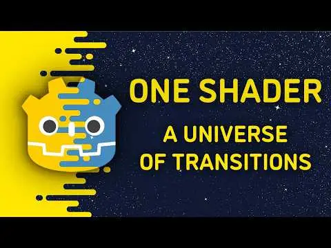
Most common transitions inside one Godot shader. 🎬
Introduction
Hint: You can watch a brief guide video of the shader on my youtube channel, or see it on Godot Shaders
This shader provides a flexible and highly customizable system for creating animated transitions between visual elements in a Godot project. It supports a wide variety of transition styles, such as:
- Directional Wipes: (left, right, top, bottom, diagonal)
- Clock Wipes: (radial, with multi-sector support)
- Iris/Shape Reveals: (polygon-based transitions with any number of sides)
- Dissolves
- Fades
- Slides
- Combinations & Variations
To get started quickly, jump to the quickstart or common transition recipes sections.
For in depth documentation, check the parameters reference section.
Quick Start
- Attach the shader to any
CanvasItem(like aSprite2DorTextureRect).
- Alternatively, you can clone this repository and open the included demo project for a ready-to-use example.
- In the Godot Inspector, navigate to: Material → Shader → Animation
- Adjust the
progressvalue to trigger a transition. - Explore other parameters to try different transition styles and effects.
Common Transition Recipes
Let's cook! 🍜
Hint: Each recipe contains only the most basic 'ingredients', without which the recipe wouldn't work. Feel free to add any additional parameters to get variations of these recipes.
Simple Fade
transition_type: Basicgrid_size: (0.0, 0.0)basic_feather: Any value > 0.0
Directional Wipe
transition_type: Basicgrid_size: (1.0, 0.0) or (0.0, 1.0) or (-1.0, 0.0) or (0.0, -1.0)
Corner Wipe
transition_type: Basicgrid_size: (1.0, 1.0) or (-1.0, -1.0) or (-1.0, 1.0) or (1.0, -1.0)
Diagonal Wipe
transition_type: Basicgrid_size: (1.0, 1.0) or (-1.0, -1.0) or (-1.0, 1.0) or (1.0, -1.0)rotation_angle: 45.0
Center Wipe
transition_type: Basicposition: (0.5, 0.5)
Blinder Wipe
transition_type: Basicgrid_size: (0.0,abs(y) > 2.0) or (abs(x) > 2.0, 0.0)
Grid Reveal
transition_type: Basicposition: (0.5, 0.5)grid_size: (10.0, 10.0) - or any abs(x) > 0.0; abs(y) > 0.0;
Staggered Grid Reveal
transition_type: Basicposition: (0.5, 0.5)grid_size: (10.0, 10.0) - or any abs(x) > 0.0; abs(y) > 0.0;stagger: (1.0, 0.0) or (0.0, 1.0)
Mixed Stagger Reveal
transition_type: Basicposition: (0.5, 0.5)grid_size: (5.0, 5.0)stagger: (1.0, 1.0)
Cross-shaped Transition (All corners wipe)
transition_type: Basicposition: (0.5, 0.5)stagger: (1.0, 1.0)
Diagonal Popping Squares
transition_type: Basicposition: (0.5, 0.5)grid_size: (5.0, 5.0)progress_bias: (10.0, 10.0)
Step Wipe
transition_type: Basicposition: (0.5, 0.5)grid_size: (5.0, 0.0) or (0.0, 5.0)progress_bias: (5.0, 0.0) or (0.0, 5.0)
Mask Reveal
transition_type: Maskposition: (0.5, 0.5)mask_texture: Any black & white texture
Alternating Mask Grid
transition_type: Maskposition: (0.5, 0.5)grid_size: (5.0, 5.0)mask_texture: Any black & white textureflip_frequency: (1.0, 2.0)
Iris Transition
transition_type: Shapeposition: (0.5, 0.5)edges: 64shape_feather: 0.1
Spike Transition
transition_type: Shapeposition: (0.5, 0.5)edges: 3grid_size&rotation_angle:(0.5, y) & 0.0or(x, -0.5) & 90.0
Scratch Lines Reveal
transition_type: Shapeposition: (0.5, 0.5)grid_size: (50.0, 5.0)edges: 3flip_frequency: (2.0, 1.0)
Overlapping Diamonds
transition_type: Shapeposition: (0.5, 0.5)grid_size: (0.5, 50.0) or (50.0, 0.5)edges: 3shape_feather: 0.0
Corner-Clock Transition
transition_type: Clockinvert: truegrid_size: (1.0, 1.0) or (-1.0, -1.0) or (-1.0, 1.0) or (1.0, -1.0)
Center-Clock Transition
transition_type: Clockinvert: trueposition: (0.5, 0.5)grid_size: (1.0, 1.0) or (-1.0, -1.0) or (-1.0, 1.0) or (1.0, -1.0)
Fan Transition
transition_type: Clockinvert: truegrid_size: (1.0, 1.0) or (-1.0, -1.0) or (-1.0, 1.0) or (1.0, -1.0)sectors: 2 or more
Seamless Striped Flower Transition
transition_type: Clockinvert: truegrid_size: (5.0, 5.0)flip_frequency: (2, 2)sectors: 16
Parameters Reference
The shader parameters are organized into the following categories:
- Shader Parameters: Generic shader settings that apply to the overall behavior of the transition, such as the
Transition Type - Positioning: Used for positioning and orientation of the transition, applying to all transition types
- Stagger: Handle offset of grid rows and columns, allowing for more varied grid patterns.
- Basic Transition Controls: Parameters specific to the "Basic" transition type.
- Mask Transition Controls: Parameters specific to the "Mask" transition type.
- Shape Transition Controls: Parameters specific to the "Shape" transition type.
- Clock Transition Controls: Parameters specific to the "Clock" transition type.
- Animation: Control the progression of the animation.
Shader Parameters
use_sprite_alpha (bool, default: true)
When false, the CanvasItem's original alpha is ignored.
When true, the final pixel's transparency will be the minimum of the sprite's original alpha and the transition's calculated alpha. This ensures that already-transparent parts of your sprite remain transparent throughout the transition.
use_transition_texture (bool, default: false)
When false, the shader blends from the original COLOR of the CanvasItem to a fully transparent COLOR, effectively revealing what's behind the CanvasItem.
When true, the shader blends from the original COLOR of the CanvasItem to the COLORof the texture provided under the transition_texture parameter.
Hint: If transition_texture is not set, the shader blends between COLOR and white.
transition_texture (sampler2D)
The texture that will be transitioned to when use_transition_texture is set to true.
Hint: Has no effect if use_transition_texture is false.
transition_type (int, hint: enum("Basic", "Mask", "Shape", "Clock"), default: 0 (Basic))
Selects the fundamental algorithm or visual style for the transition effect.
0(Basic): Implements simple, rectangular, gradient-based wipes and fades.1(Mask): Implements mask-based transitions.2(Shape): Generates a regular convex polygon as the transition boundary.3(Clock): Creates a radial, clock-like wipe effect.
Hint: Adjustments to parameters within a specific "Transition Controls" group (e.g. "Basic Transition Controls") will only affect the transition if the corresponding transition_type is selected.
Positioning
These parameters influence the spatial origin, direction, and tiling of the transition, and they apply universally across all transition_types.
invert (bool, default: false)
Reverses the logical direction of the transition's progression. For example, a transition that normally expands outwards would contract, or a wipe from left to right would become right to left.
position (vec2, default: (0.0, 0,0))
Specifies the position in each grid cell (see grid_size parameter) from where the transition starts.
(0.0, 0.0)- top left corner(1.0, 0.0)- top right corner(0,0, 1.0)- bottom left corner(1.0, 1.0)- bottom right corner(0.5, 0.5)- center
grid_size (vec2, default: (1.0, 1.0))
Divides the CanvasItem's area into a grid of independently animating cells. The x component defines the number of horizontal divisions, and the y component defines the number of vertical divisions. A value of (1.0, 1.0) means no division, treating the entire CanvasItem as a single cell.
Using negative values, zero values, or floating-point numbers for the grid_size introduces interesting and powerful behaviors.
For instance, (-1.0, 0.0) will create a right-to-left wipe. Values like (0.0, 0.0) can even produce a simple fade, given the transition has a blur.
Experiment to find more special grid_size values or check out the common transition recipes section for more examples.
rotation_angle (float, default: 0.0)
Rotates the local coordinate system within each grid cell (or the entire CanvasItem if grid_size is (1.0, 1.0)). The angle is specified in degrees.
Stagger
These parameters introduce offsets and flipping to individual grid cells, creating more complex and dynamic grid-based patterns.
stagger (vec2, default (0.0, 0.0))
Applies a fractional offset to the UV coordinates of alternating grid rows and columns before the transition calculation. This can create a "checkerboard" or "wave" effect when combined with a grid_size greater than (1.0, 1.0).
Hint 1: When grid_size is (1.0, 1.0) or smaller, this just offsets the transition location.
Hint 2: Due to each element having limited space in its cell, applying a stagger on both axis can lead to interesting patterns.
stagger_frequency (ivec2, default: (2, 2))
Determines how often the stagger offset is applied to grid cells.
x: Controls the frequency for rows (everyxrows are staggered).y: Controls the frequency for columns (everyycolumns are staggered).
For example, (1, 0) staggers every single row, while (2, 0) staggers every second row.
flip_frequency (ivec2, default: (1, 1))
Controls the frequency at which the local UV coordinates within grid cells are flipped (mirrored).
x: Flips horizontally everyxrows.y: Flips vertically everyycolumns.
This introduces visual variation and can create interesting symmetrical or asymmetrical patterns within a grid.
Basic Transition Controls
These parameters are exclusively relevant when transition_type is set to 0 (Basic).
basic_feather (float)
Controls the softness or blurriness of the transition's edges.
Mask Transition Controls
These parameters are exclusively relevant when transition_type is set to 1 (Mask).
mask_texture (sampler2D)
The grayscale image used as a mask for the transition. The white part of the mask shows the current texture and the black part shows the texture (or alpha) transitioned to.
use_mask_size (bool)
When false the mask texture keeps the aspect ratio of the CanvasItem.
When true the mask texture keeps the aspect ratio of the mask_size parameter. For example, if mask_size equals (50, 25), the mask aspect ratio will stick to 2:1
Hint: This is experimental and works best for grids containing a single element. Currently, for larger grids, this introduces horizontal/vertical artifacts because of fwidth's nature.
mask_size (vec2)
If use_mask_size is true, the mask_texture's aspect ratio will be determined by mask_size.x:mask_size.y.
Shape Transition Controls
These parameters are exclusively relevant when transition_type is set to 2 (Shape).
edges (int, hint: range(3, 64), default: 6)
Specifies the number of sides (edges) of the regular polygon shape that forms the transition boundary. A value of 3 creates a triangle, 4 a square (or diamond if rotated), 5 a pentagon, and so on. Higher values approximate a circle.
shape_feather (float, hint: range(0.0, 10.0), default: 0.1)
Controls the softness or blurriness of the polygon's edges. A value of 0.0 results in a perfectly sharp polygon outline, while increasing the value expands the feathered transition zone, creating a softer blend.
Clock Transition Controls
These parameters are exclusively relevant when transition_type is set to 3 (Clock).
sectors (int, hint: range(1, 128), default: 1)
Determines how many radial segments (sectors) the clock-wipe effect is divided into.
clock_feather (float, hint: range(0.0, 16.0), default 0.0)
Controls the amount of feathering or blur applied to the edges of the individual clock sectors. A 0.0 value produces sharp, distinct sector edges, while higher values create a smoother transition.
Animation
These parameters are the backbone of this shader as they control the timing of the transition.
progress (float, default: 0.0)
The primary control for advancing the transition. It is the overall stage of the animation.
Typically, 0.0 means the transition has not started, and 1.0 means the transition is complete. (or the other way around if invert is set to true)
Hint: Sometimes this is not the case. For example, one might provide a mask that's too small and needs values greater than 1.0 to fully cover the CanvasItem area. In such cases, play around with the property to figure out when the animation starts and when it ends.
progress_bias (vec2, default: (0.0, 0.0))
Applies an additional offset to the progress value for each individual grid cell.
- The
xcomponent biases progress across columns. - the
ycomponent biases progress across rows.
This allows for creating "wave-like" or "staggered" animation effects where grid cells transition at slightly different times based on their position.
Contributing
If you find any bugs, improvement ideas, interesting recipes, feel free to fork this repository and suggest a change. Since the shader is quite simple, exploring and contributing to it can be a valuable learning experience for beginners.
If you'd like to see an improvement, but don't know how to contribute, you can create an Issue.
License
This project and shader falls under the CC0 license, meaning that you can do anything you want with the code here, even use it commercially. You do not have any obligation to credit me, but doing so would be highly appreciated.
Support

Donations are appreciated and help me continue creating free content. Please donate only what you can afford. 🥜
Check out the full documentation in the GitHub repository: https://github.com/cashew-olddew/Universal-Transition-Shader
This shader provides a flexible and highly customizable system for creating animated transitions between visual elements in a Godot project. It supports a wide variety of transition styles, such as:
- Directional Wipes: (left, right, top, bottom, diagonal)
- Clock Wipes: (radial, with multi-sector support)
- Iris/Shape Reveals: (polygon-based transitions with any number of sides)
- Dissolves
- Fades
- Slides
- Combinations & Variations
Reviews
Quick Information
Universal Transition Shader
Check out the full documentation in the GitHub repository: https://github.com/cashew-olddew/Universal-Transition-ShaderThis shader provides a flexible and highly customizable system for creating animated transitions between visual elements in a Godot project. It supports a wide variety of transition styles, such as:- Directional Wipes: (left, right, top, bottom, diagonal)- Clock Wipes: (radial, with multi-sector support)- Iris/Shape Reveals: (polygon-based transitions with any number of sides)- Dissolves- Fades- Slides- Combinations & Variations
Supported Engine Version
4.4
Version String
1.1.0
License Version
CC0
Support Level
community
Modified Date
24 days ago
Git URL
Issue URL